
I may get a paid commission for purchases made after clicking a link in this post, click here to read my disclosure.
Learning how to create a landing page is one of the most important skills you will ever learn when it comes to blogging and building any successful online business.
Whether you are trying to sell a product, convince visitors to subscribe to your email newsletter, buy a product, or pay for a service that you are selling, landing pages are vital to turning your website’s visitors into subscribers or even better customers.
The colors, words, and aesthetics you use for your landing page really have a very big impact on how people perceive you and your brand and more importantly, how easy it is for them to trust you or even remember your name.
In this post, we will be looking at how to create a landing page that grabs the user’s attention from start to finish, gets them to trust you and your brand enough to subscribe to your newsletter, and most importantly, buy products and services from you in the long run.
So if you are ready, let’s get right to it…
What are Landing Pages?
Landing pages are pages that the user lands on when they click on a link that leads to a product sales page, newsletter signup, or even your blog, they are usually the most important pages to design as they usually determine if a user will eventually signup for your email newsletter, buy a product on your online shop or just exit your web page without doing any of the above.
The average conversion rate for even the most seasoned of webpages is about 9.5% as there is a 4.2% loss in conversions if a website takes longer than 3 seconds to load which stretches the importance of improving website speed in order to make sure there is minimum bounce rate on your landing page.
Most importantly, the better your webpage design and utilization of super-fast website themes, the higher your conversions from your landing pages.
Why are Landing Pages Important?
Landing pages are important because they are usually the first page that a user sees on their search for either more answers to a question they have or a product they want to buy.
Which means, a wrong landing page that is difficult for a user to understand or harder to navigate discourages the searcher and makes them click out of your website without continuing further which leads to a higher bounce rate as people click out of your page and is one of the biggest SEO mistakes bloggers make.
Your landing page must meet the search intent of the searcher, be easy to navigate and take action on, have relevant call to action (CTA) buttons, limit the number of steps between the user and their search goal and proposed solution, and most importantly provide the searcher an answer to their problem.
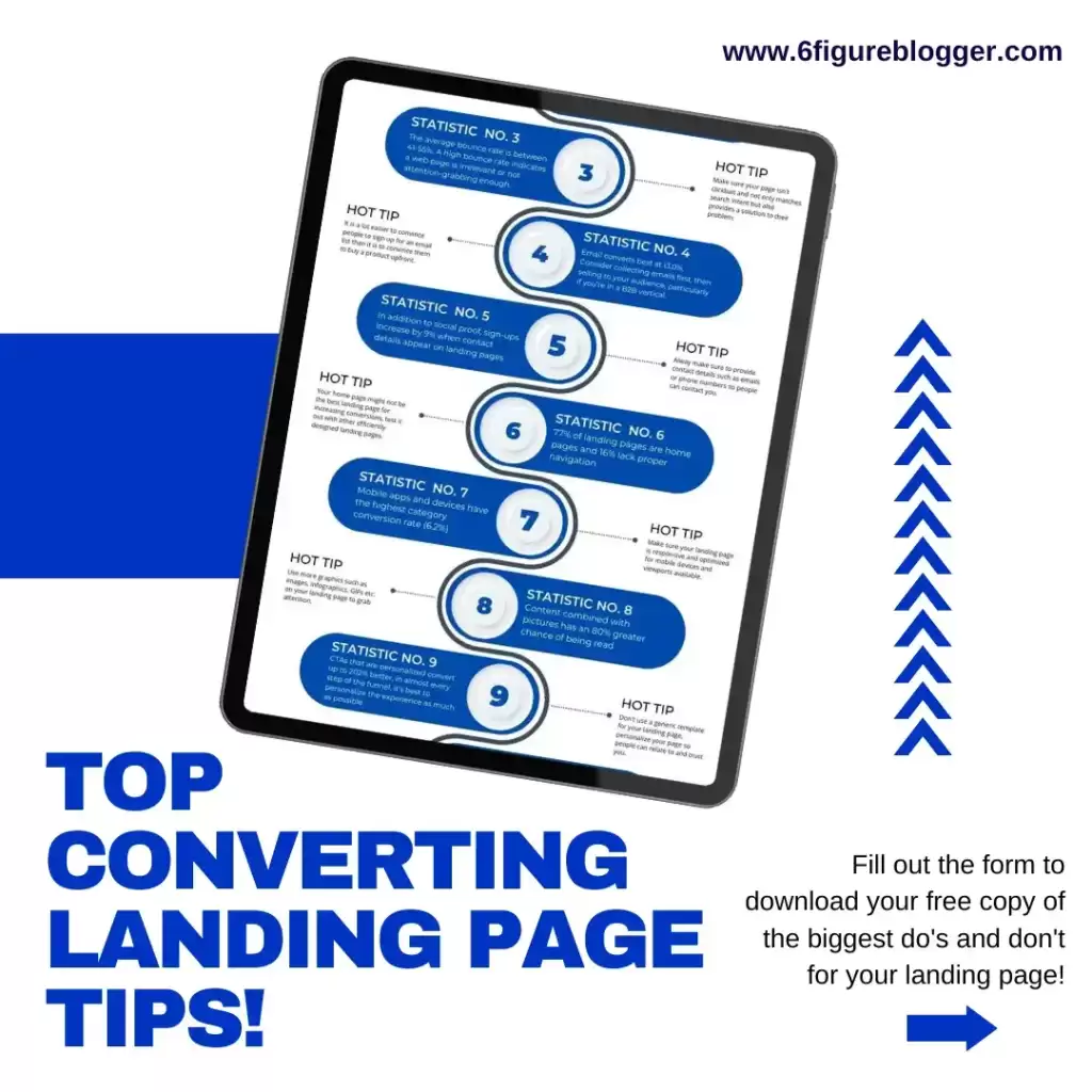
Landing Page Conversion Statistics
There are so many landing page conversion statistics that you can look into to help you create a high-converting landing page for your blog, product/service business website,
I have compiled these hot tips into an infographic cheat sheet just for you.
Simply enter your email address below download your own free copy now and get started optimizing your own landing page!
Factors Affecting LandingPage Conversion
1. Website Speed
Website speed is usually one of the biggest factors affecting landing page conversions today, the reason is that the average reader has a very short attention span, and if it takes longer than 3 seconds for your landing page to load, the chances are that people are going to be clicking out of the page faster than you can say click.
It is vital to optimize your website so that images, posts, designs, etc. load as fast as possible to be able to stop the user from clicking out of your website.
I have written a very comprehensive post on website speed to help you increase how fast your website loads in a very short amount of time.
I have also included website speed optimization tools, tips, and cheat sheets that you can easily download here.
2. Call to Action Buttons Position On your Webpage
The implementation of call-to-action buttons on your website can have a really huge impact on your conversion rate
The reason is that most people don’t know what they want until you show it to them, Putting up CTA buttons where necessary helps to grab attention and get the users to take action and find a solution to their problem
Use attention-catching colors that go with your brand identity like yellow, orange, or sky blue to call the users’ attention to your CTA buttons.
It is vital to place CTA buttons on specific parts of your web page where they can easily be seen and quickly clicked on like the Hero part of your webpage and the middle section.
3. Avoid Content Cluttering
One of the biggest mistakes that reduce the amount of conversions you can get from your landing page is content cluttering.
When there are too many items on your webpage that are not properly spaced out and are written in a font that makes it difficult to read, chances are that people won’t read it.
Be sure to use enough white space, colors that are easy on the eyes, and proper formatting and paragraphs and headers that make your writing easy to read and understand.
4. Use the Same Keywords or phrases on your Landing Page (Lead with the Offer you Promised)
Leading with the same keywords and phrases you used in your links or email funnels on your landing page assures the reader that they are in the right place and have not been click-baited.
It gives them the assurance that they can keep going to get the answer to their problem by taking action on the landing page.
5. Simplify your Landing Page
There is power in simplicity, making your landing page look over complicated can be such a turn-off for people and make them click out of your website.
Instead of complicating steps and designs on your webpage, make everything more accessible for people to use and understand by simplifying the process as well as the design.
You can create a seamless and easy-to-use workflow for your readers that can help guide them through the steps to take on your webpage that lead them to their solution.
Principles of Highly Effective Landing Pages
1. Credibility Demonstration
You want to let people know that you are a trustworthy source in the industry and a good way to let people know this is by using colors and Design usually associated with that industry, showing off your featured work as well as other proof of positions such as interviews or awards to help people understand your authority in the industry, include testimonials where necessary, reviews of your bestselling books, and information about the background of the business.
2. Attractive Offer
An attractive offer that gets people to take action on your website, make sure to present it in such a way that the searcher can’t refuse and in a way that makes it more appealing than your competitor’s offer.
3. Objection Handling
Another important step is to take out the objections or obstacles stopping people from taking action on your landing page, this can be anything from removing fields in forms that make people second-guess if they really want to sign up or not like asking them to provide their home address, make the process a lot easier by decreasing the number of steps to prevent discontinuation of the process.
4. Social Proof
These days, people hardly believe any business or service without an online presence or social media proof, hence the reason it’s so important to bring your business online, this makes it a lot easier to gather Testimonials of people who took action and how it has helped them and to provide that proof of commitment and trust to other people looking to get the same results.
5. Ease of Use
How easy is it to use your webpage? is it easy to use and seamless or are there call-to-action buttons and forms interrupting the user every step of the way, Ensure to use non-intrusive call-to-action buttons and improve on the page design and color use.
6. Result of Click CTA buttons
Your call to action should deliver people a step closer to their goal after they click on the link, whether it is being signed up to an email list, taken to a webpage to purchase products, etc., the user should feel that all or part of their problem has been solved by this process.
What Does a Good Conversion Rate Look Like?
Depends on the audience, offer and source of traffic, and what your competitors are offering as well, landing pages with less than 4% conversion rate have something wrong going on, with 5% to 10% conversion rate is good, 10 to 25% conversion rate is fantastic and the highest conversion rate is usually 43%
Landing Page Hacks
1. Lots of whitespace usage
This is very important to bring that balance to your website and make people feel relaxed enough to take the necessary actions since they are able to see every element on the webpage easily.
Complement this use of white space with colors that represent your brand and make the user feel like they are on your website.
2. Use Icons of other established websites in your industry to establish credibility
If you have an existing relationship with other websites in your niche and you have done something for them for example a guest post or maybe even designed an infographic for one of their posts then you can utilize this relationship to create more credibility in your business by adding them to the ‘As seen on” part of your webpage.
This lets your users know that you have a good amount of authority in your niche since you have a vote of confidence from other really established websites and names in your industry.
3. Use an Animated GIF in the Hero section of your website
The main purpose of using an image on your webpage is to grab the users’ attention and not make things so boring.
It is very important to add a photo or two instead of just a wall of text that makes readers want to scream and run in the other direction.
A good way to do this is to find a part of your webpage where an image would make the most sense to illustrate or support your point and add one there, it can be anything from a random image, a funny gif, or even a really informative infographic that your readers will benefit from.
Here are some of the best stock photo websites to get high quality images from for your blog.
4. Build Excitement around your Product or service
The last thing you want is to create a landing page that has just static images and boring sentences that don’t appeal to the reader.
Make sure use words, pictures and even videos to make your landing page more attractive and aesthetic, this way, it grabs the readers attention and stops them from scrolling.
You can even embed a YouTube video that plays automatically when the use lands on the page, this way they can listen to some attention grabbing sentences before deciding whether or not to click out of the web page or not.
5. Include Social Proof in The Hero Section of Your Landing Page
People and even search engines find it a lot easier to believe your expertise and authoritativeness in a given niche or topic if you have a social proof.
Linking your social media accounts to your landing page, not only tells the reader that you are legit but that you are also very passionate, knowledgeable and easy to reach whenever they have any questions regarding your products or service.
6. Use Anchors to Link to Specific Parts of The Same Landing Page
It can be quite a struggle to arrange things on a web page, especially when you have a lot to say and don’t know which one should come first or how to stop your page from looking very cluttered.
This is where anchor links come in, use anchor links to shorten large texts, images or videos by simply linking out to the lower in the page, this makes things cleaner and the reader is more able to see and click on the things they need.
7. Use Bright colors for your CTA buttons and A/B Test Different types of CTA Buttons
Different colors have different effects on readers and so it is vital to test out different colors and designs of your CTA button to see which one has the highest potential of attracting the most attention.
Brighter colors tend to attract the attention of the reader and are usually recommended for CTA buttons because it is something that they simply can’t miss on a page.
There are so many software available today for A/B testing, the most popular ones are VWO, AB Tasty and Optimizely, they provide so many options and details depending on what exactly you are testing for so feel free to check them out.
In addition to CTA buttons, you can also A/B test, images, sentences, email signup forms and so much more!
8. Decrease the number of Choices or steps it takes for the users to take Action
As human beings, we love everything simplified, it’s just our nature, no one likes to be stressed out, they want the fastest solution to the problem at least 70% of the time.
Which is why it is very important to decrease the number of steps between the reader and their solution or at least the promise of a solution.
This is why short signup forms that have only 2 entry fields of just name and email address will perform 10X better than a form with full details such as first name, last name, country, P.O. Box etc.
My advice – make it as short as possible!
9. Highlight testimonies of your clients or readers
Most people get put off when you sound desperate while trying to convince them to signup for a newsletter or service that you are offering or even a buy a product that you are trying to sell them.
The best approach to take to solve this problem is to give the a reason to buy the product that you are selling, what special solution does your product solve that they can’t find somewhere else?
Why should they choose to listen to you and not other people?, how are you different from your competitors?.
If possible, go ahead and attach proof of your previous clients who benefited immensely from your product and post their reviews and success stories.
10. Tell visitors how your product or newsletter provides them value
Most people don’t care about the features of a product and how better it is in comparison with other products in the same niche, they are simply interested in how the products makes their lives easier or gets the job done faster.
If you want to get people to sign up for something or buy a product, focus on highlighting the benefits of that product to your target audience and showing them how that product simplifies their job and saves them a lot of time!
11. Create excitement and suspense for more things coming soon
Selling an idea or a product will be a lot easier and more enticing to the buyer if they have a promise of more added value to the product that they are purchasing.
For example, if a customer paid for a training course on your platform, you could offer them a one year access to all the new data, free software offers and updates up to one year after their course subscription has already ended without having to pay for it.
This increases the value of the product in a customers eyes and pushes them to make a decision faster.
12. Add an FAQ section to answer 5 to 10 of your users’ most popular questions
The best way to reduce the bounce rate on your landing page from people who feel that their questions are not being answered is to have answers to their questions ready before they even ask for it.
Think of 5 to 10 answers that people who are signing up to your service or buying your new eBook might have and leave answers to them on your landing page, This way, they have access to the full information and more!
6FigureBlogger
13. Do a product demo or teaser video for your potential customers
Alas, written texts aren’t the only way to grab a readers attention, you can also create video and demo tutorials that grab the attention of your target audience right away!
You can take advantage of these videos to showcase your product and highlight its benefits and most valuable features to your audience.
Conclusion
In conclusion, crafting a landing page that converts 43% of visitors into subscribers is no small feat, but with the right strategy and attention to detail, it’s entirely achievable.
By following the steps outlined in this blog post, from understanding your audience and setting clear goals to optimizing your design and testing different elements, you can significantly boost your conversion rates and build a robust subscriber base.
Remember, the key to success lies in continuous improvement.
Regularly analyze your landing page’s performance, A/B test new ideas, and stay updated with industry trends to ensure your landing page remains effective over time.
With dedication, creativity, and a commitment to delivering value to your audience, you can not only hit that impressive 43% conversion rate but also establish a strong and engaged subscriber community that propels your business forward.
Happy converting!